
GOPRO APP - UX CASE STUDY
When taking part in the the Academy Xi UX UI Elevate course, I was challenged with redesigning the GoPro iOS mobile app. Implementing all UX processes and learnings to improve the current mobile user experience and deliver a more human centred product.


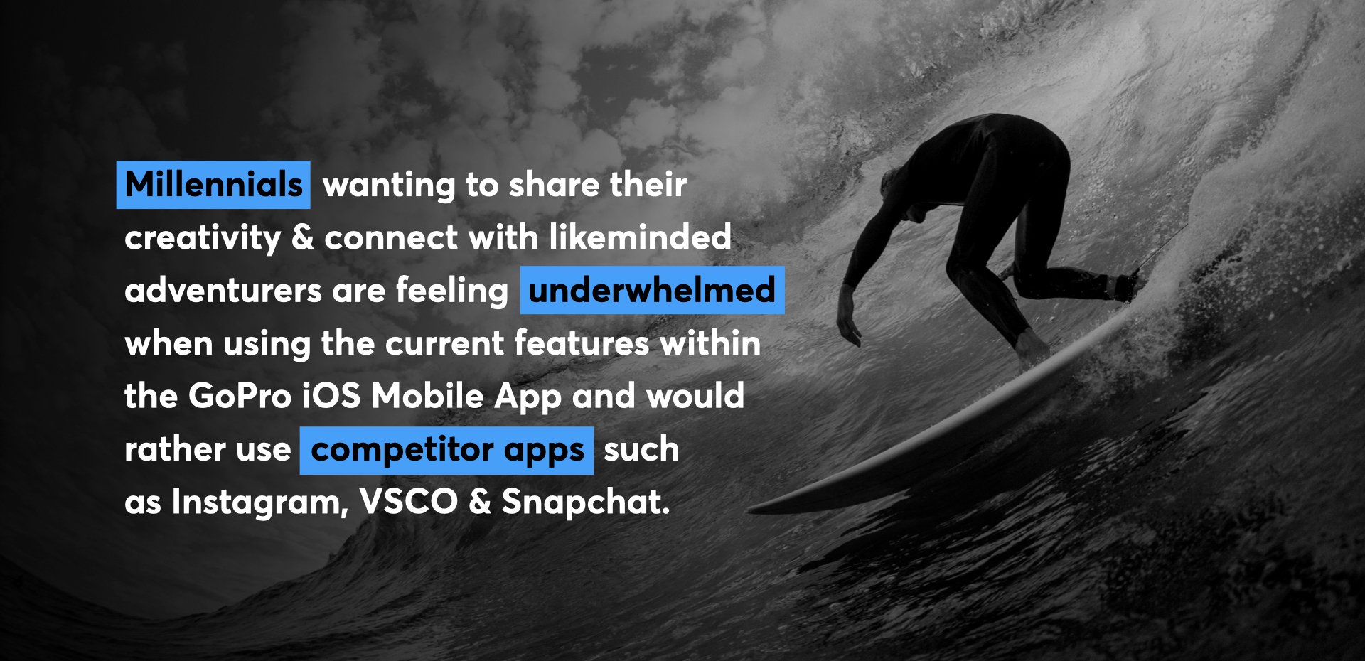
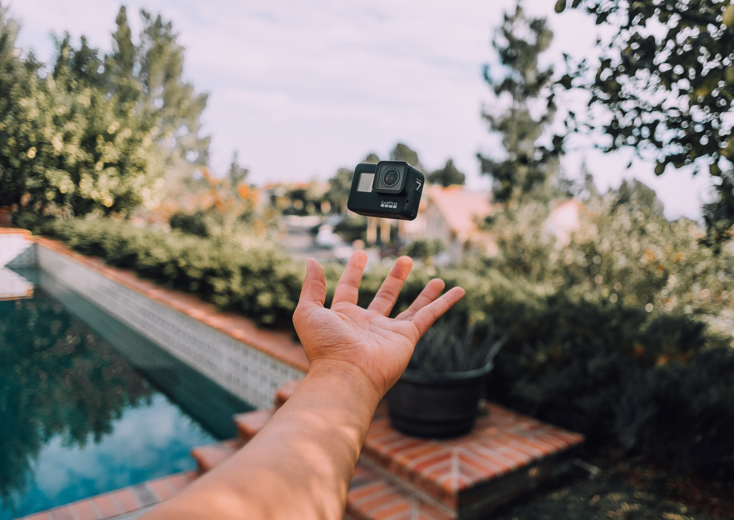
GoPro’s insanely successful action-cam has a global footprint. The cost of the camera is now under $500, and millions of people are using it to document the adventurous side of their lives. GoPro has a problem though, their current mobile app. For a camera that’s changing the world, this app is admittedly dull and doesn’t push the envelope. GoPro has put you in charge of delivering a new mobile app, one that stands out from the photo environment today, one that will appeal to millennials.

PROJECT CANVAS
The first step in my process was fully understanding both my client and customer needs.
Scoping the project involved exploring the project purpose, outlining the overall outcomes
and deliverables, whilst defining challenges and methodology.


THE DOUBLE DIAMOND APPROACH
Developed in 2004 by the UK Design Council as a framework, I decided to use the
Double Diamond UX approach in my own project to give a clear structure.


The Discovery phase includes understanding the current use of the GoPro app by collecting quantitative and qualitative data through surveys and one-to-one interviews, reviewing the market with a Competitor Analysis and evaluating the features of the current iOS app, by using Jakob Nielsen’s heuristics model to highlight whether the app follows UX best practices.

RESEARCH PLAN
Carrying out these research methods ensured I got valuable insights
for the ‘Define’ stage of the Double Diamond process.


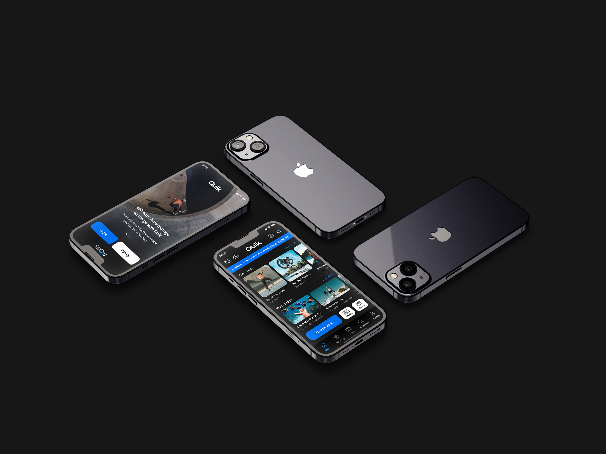
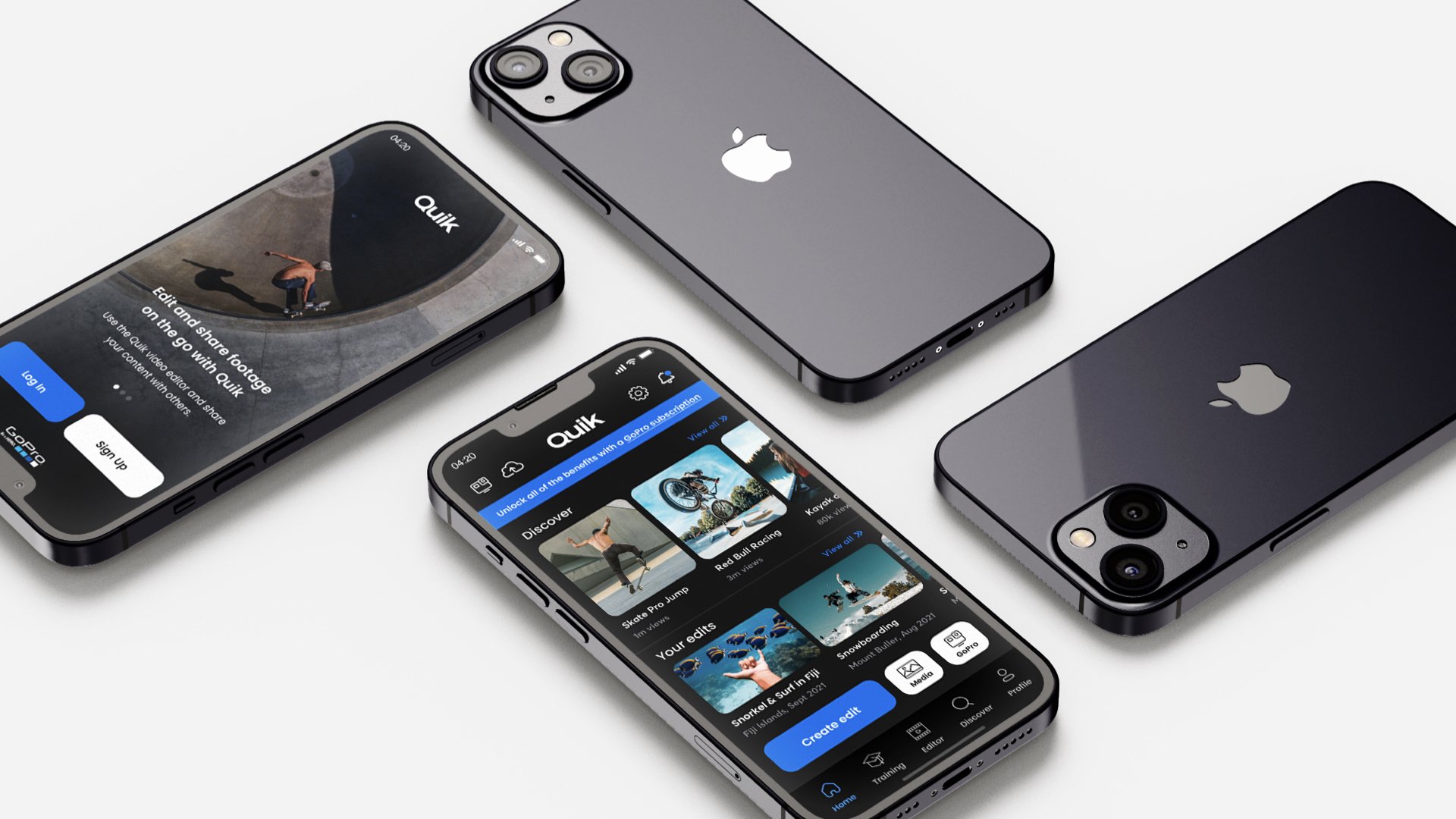
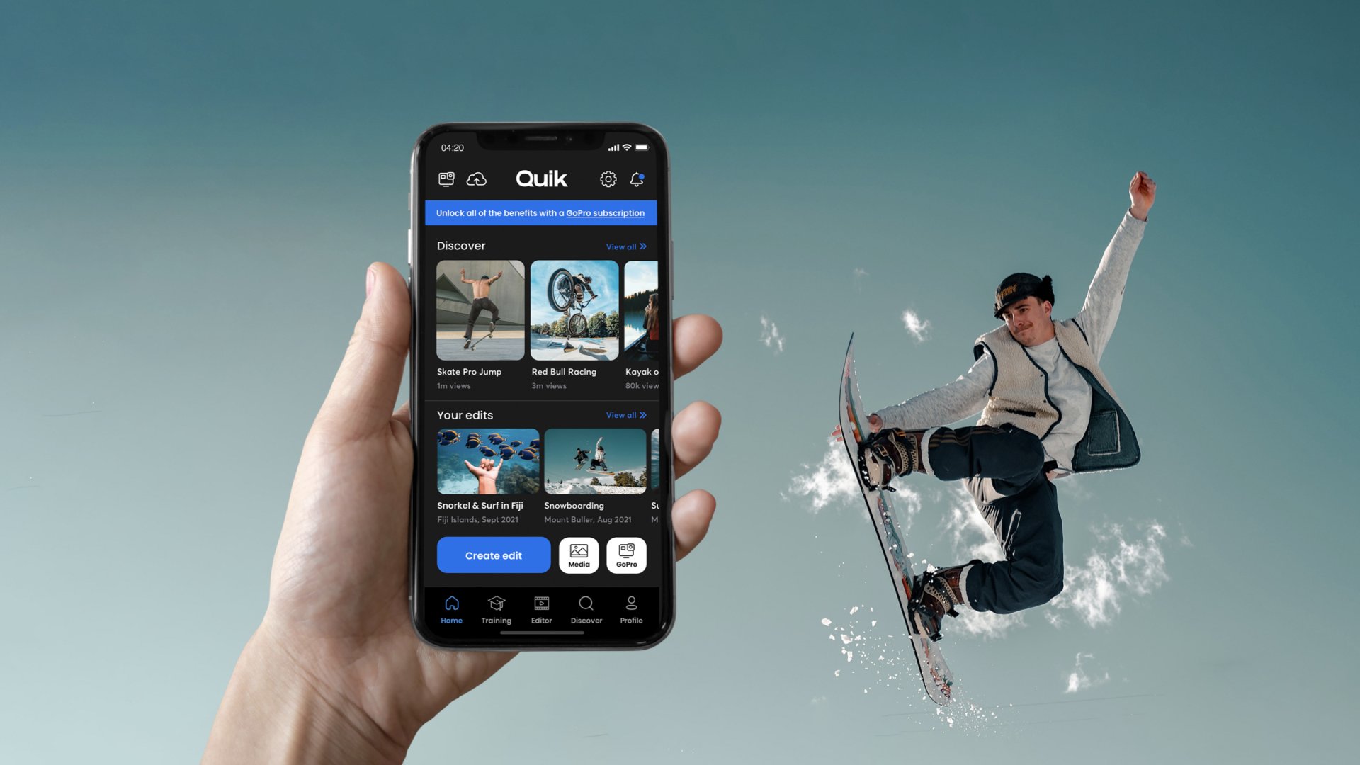
GOPRO QUIK: APP OVERVIEW
Using my personal HERO4 GoPro Camera and the latest version of the app installed on my iPhone 12, I analysed all elements of the existing GoPro Quik app based on UX best practices.

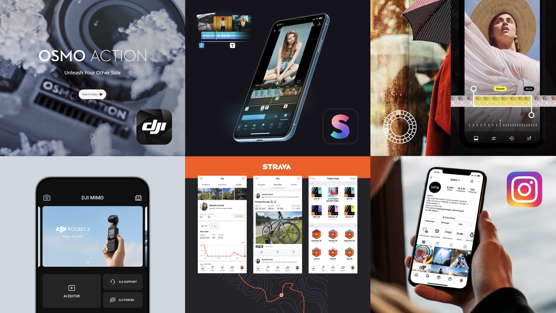

COMPETITOR ANALYSIS
Assessing the strengths and weaknesses of each competitor app highlighted potential opportunities for further features that are currently missing from the market. Some of the key strengths included tutorials and onboarding, user connection, gamification and inspiration.


USER SURVEYS
With a total of 15 survey respondents, the collection of
quantitative data gave a general view of the problem space.
ONE-TO-ONE INTERVIEWS
I conducted a total of three 30-minute interviews, all with frequent users of the GoPro Quik app within my target audience. The qualitative data gave me a more focused view of the problem and helped to identify the motivations, habits and feelings towards the app.
These research findings were used to help influence customer personas, customer journey maps and inform insights to influence UX design choices in the define stage of the double diamond process.


The define stage includes leveraging insights from the research and key findings to highlight significant themes and areas of focus, presenting opportunities to develop further.

AFFINITY MAPPING
Affinity mapping enabled me to organise the large amount of data collected in my user research into groupings based on their natural relationships. The aim here was to sort my data into clusters of similar themes, groups and patterns.


EMPATHY MAPPING
Empathy mapping allowed me to further synthesise my research from a human centred perspective – reaching further insights by empathising with my target users. I needed to consider how people were thinking and feeling when using the existing GoPro Quik app.


CUSTOMER PERSONAS
My personas or ‘Archetypes” were defined by the information I had collected, highlighting wants and limitations in the user experience. This was a good way to humanise my research and conclude what I had learned about our users.
CUSTOMER JOURNEY MAP
A key client deliverable, the Customer User Journey uncovered unique aspects of the customer’s interaction with the Quik app, revealing insights into the design problem. This shows the relationship and experience my personas had with the app.


With a better understanding of the problem being solved, I moved into the develop phase of the double diamond framework. Using ideation techniques to explore effective solutions, whilst sympathising with the user.
HOW MIGHT WE STATEMENTS
Using ‘How Might We’ statements, I reframed the design problems into potential opportunities.
HMW… How might we [WHAT] for [WHO] so that [WHY]?
HMW… Improve the experience for millennials so that they can feel connected to likeminded adventurers.
HMW… Improve the range of features for millennials so that they can feel inspired to create content.
HMW… Highlight the subscriber benefits to those paid users so that they feel valued and continue to be a subscriber.
HMW… Highlight the subscriber benefits to free trial users so that they feel encouraged to subscribe.
HMW… Re-consider the navigation for frequent and new users to improve the user flow and reduce user errors.
HMW… Make the video editing process easier for users with no video editing experience so that they don’t feel overwhelmed.
HMW… Provide training for unexperienced users so that they feel supported when having difficulty with the video editing process.
HMW… Improve the overall experience for time poor users so that they can create engaging content on their mobile devices.
HMW… Encourage competition between users so that they feel a need to create more engaging content.

BRAINSTORMING AND CRAZY 8’S
I first brainstormed ideas in response to my HMW statements; a relaxed, informal approach to problem solving combined with lateral thinking. Further to this I completed a fast sketching exercise called ‘Crazy 8’s’, sketching eight distinct ideas in eight minutes – one per minute.
STORYBOARDING
Based on one of my ‘Crazy '8’ ideas and with my personas in mind, I created a storyboard to communicate the story of one of my archetypes using this particular feature; visually explaining the end-to-end journey of my idea and visualising this for the client.

SORTING IDEAS
A Minimum Viable Product (MVP) matrix diagram was used to sort my ideas, identifying the value of the features or solutions against my user and client needs. The criteria was assessed by the time, cost and effort to create it.


UX ARCHITECTURE
The next step of the Develop Phase was to work out the Information Architecture (IA). I first used the card sorting method with 6 participants, carrying out a closed card sort where users were given both page cards and category labels. They were asked to organise them into logical categories where they thought the feature would best fit, resulting in a more accurate IA.


It was now time to build, test and scale solutions, working towards preparing their implementation in an improved user experience. This stage takes into consideration both UX and UI best practices.
MY APPROACH
Due to time limitations and client budget, I planned to take a phased
approach based on the identified MVPs and users needs.

LOW FIDELITY WIREFRAMES
Before moving into UI design, it was important to first create low fidelity wireframes to determine a blueprint for the design stage. Taking into account the including page content, interactions, navigation, setting an overall structure for the app. I used prototyping tool Invision to test my initial wires.


UI DESIGN STYLEGUIDE
UI design style guide based on best practice, taking into consideration accessibility.


UI ELEMENTS
Including logo formats, iconography, CTAs, navigational menus and error states.

COLOUR ACCESSIBILITY
Adhering to WCAG compliance and meeting Level AA criteria.


HIGH FIDELITY DESIGNS
After setting my UI and photography style, I updated my wireframes to implement this look and feel. Due to time constraints, I was unable to test the wires prior to designing, but in this circumstance this was done after creating high fidelity designs, which meant also testing my user interface to make sure iconography, colours and language were easy to follow.


USER TESTING
Overall, nine participants took part and completed my user testing on high fidelity wires using platform ‘Maze.co’. Two were in-person and the other seven were done remotely.

DESIGN ITERATIONS
The outcomes from my usability testing were insightful and allowed me to make design iterations based on my learnings.

KEY LEARNINGS
User Research to understand audience
By collecting qualitative and quantitative data I was able to better understand my users, and create personas to humanise their needs within the app. I related back to these throughout the whole process to ensure I was meeting their needs.
The importance of User Testing
By analysing my results, I realised just how important user testing is to the process of designing a product. Many features that I assumed would be easy for the user were in fact difficult and confusing. It was very interesting to see where users got confused and found pain points when interacting with the app. By reviewing heat maps and watching in-person performance, I could improve their experience.
A product is never ‘complete’
User testing and research is a continuous cycle as trends and technologies evolve, we begin the double diamond process again. We need to adapt to these changes and continue to keep on improving features based on users habits and needs, even in the future.